top of page


NIP + FAB
PACKAGING
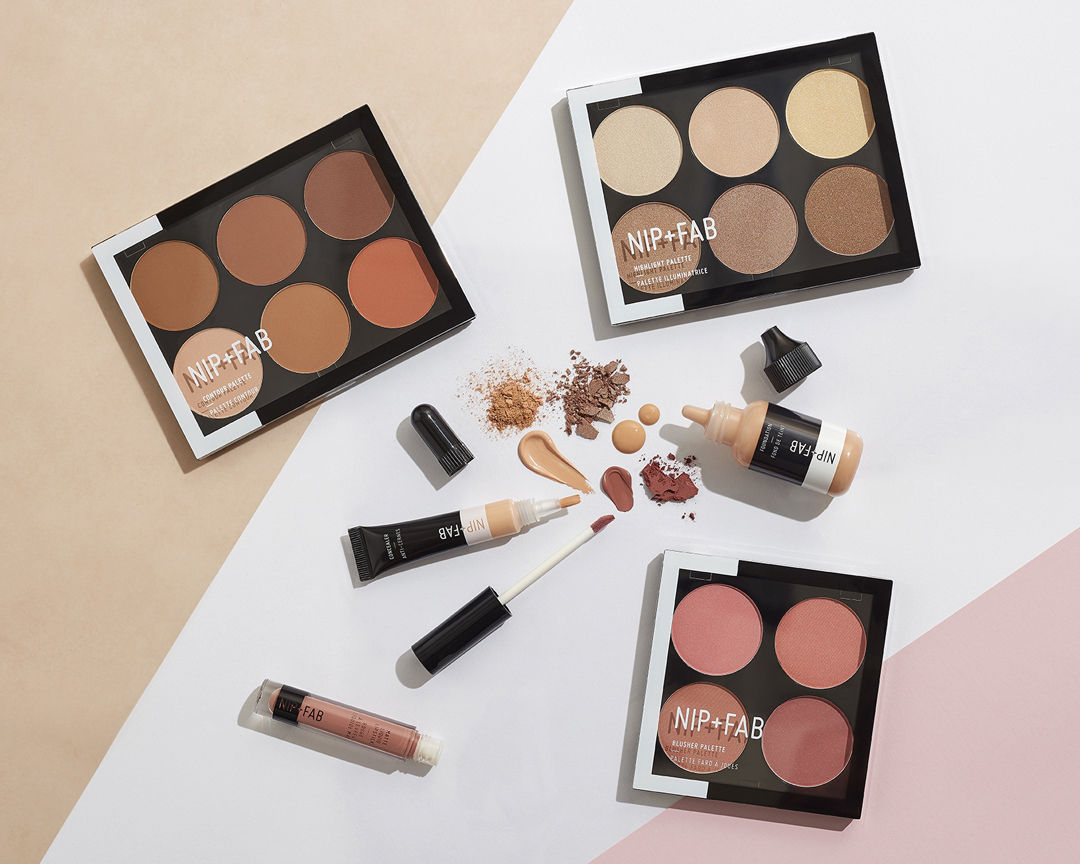
Bold, ingredient-led packaging design for Nip + Fab’s skincare ranges, developed for high street retail. The project delivered scalable primary and secondary packaging systems that clearly communicate active ingredients and product benefits across a broad SKU range.
Services
-
Packaging design systems for skincare and makeup ranges
-
Primary and secondary packaging artwork
-
Colour-coded range systems for active ingredients and skin concerns
-
Typography, layout, and hierarchy development
-
Production-ready artwork for high-volume manufacture


BETH FOX FULLER
bottom of page